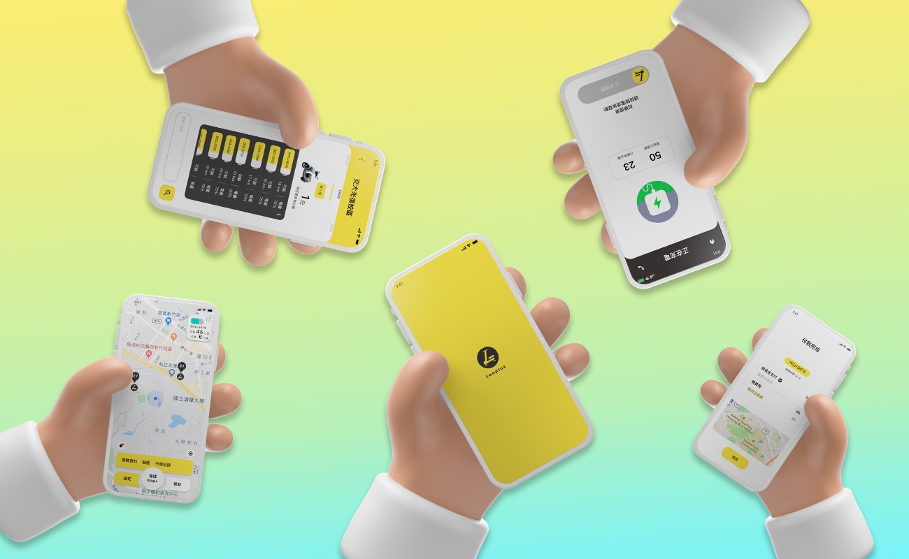
Looplus

Looplus
Students in the National Yang Ming Chiao Tung University campus and eastern Hsinchu rely heavily on their vehicles for daily commutes. However, it is inconvenient for those who don't have a personal vehicle. To have people enjoy the high mobility in Hsinchu City, Looplus is devoted to building an e-scooter rental app to satisfy students' traffic needs.
Students in the National Yang Ming Chiao Tung University campus and eastern Hsinchu rely heavily on their vehicles for daily commutes. However, it is inconvenient for those who don't have a personal vehicle. To have people enjoy the high mobility in Hsinchu City, Looplus is devoted to building an e-scooter rental app to satisfy students' traffic needs.
Role
UIUX Designer
Defined the user flow and designed the mobile UI, collaborating with 2 product managers
Duration
4 Months
4 Months
February - June 2020
February - June 2020
Overview
Goals
Looplus is a startup in Taiwan aiming to provide users with an efficient e-scooter rental service. We want to build a mobile app where users can check scooters for rental, get access from charging stations, and activate scooters fluently.
Looplus is a startup in Taiwan aiming to provide users with an efficient e-scooter rental service. We want to build a mobile app where users can check scooters for rental, get access from charging stations, and activate scooters fluently.
Challenge
Students and faculty are used to commuting by school bus and their vehicles. However, they still suffer from pain points that are not efficient and economical when across the spacial campus.
Students and faculty are used to commuting by school bus and their vehicles. However, they still suffer from pain points that are not efficient and economical when across the spacial campus.
Outcome
Looplus provides students with a handy and smart way to ravel across campus and received a ranking of 4.2 on the App Store.
Looplus provides students with a handy and smart way to ravel across campus and received a ranking of 4.2 on the App Store.
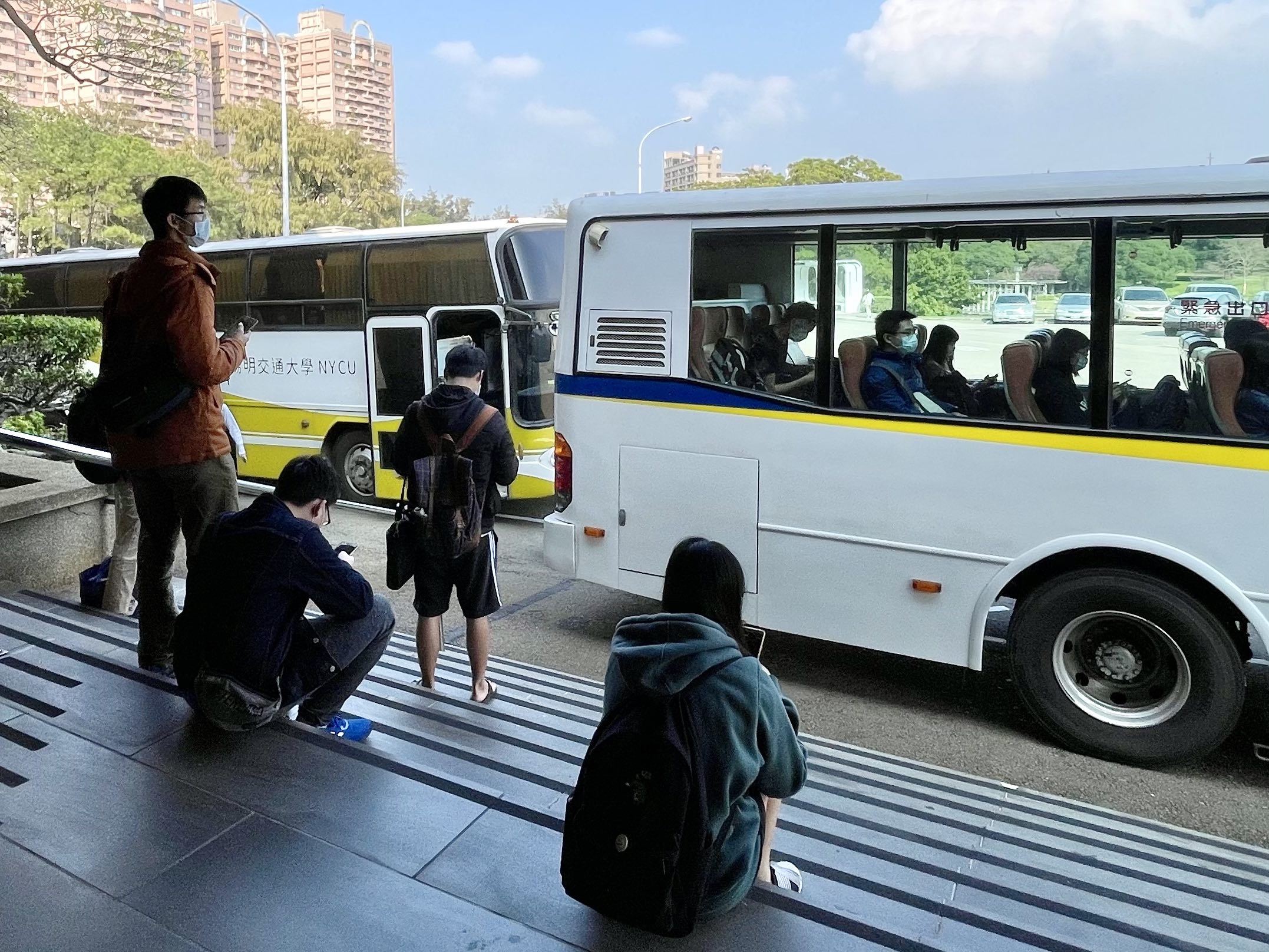


Field Research
Two takeaways from scooter parking lots and school bus stops:
The only way for junior students and those not having scooter licenses to commute is by taking the one-hour round school bus.
It is not easy for students to find parking spaces during rush hours.
Two takeaways from scooter parking lots and school bus stops:
The only way for junior students and those not having scooter licenses to commute is by taking the one-hour round school bus.
It is not easy for students to find parking spaces during rush hours.


User Persona
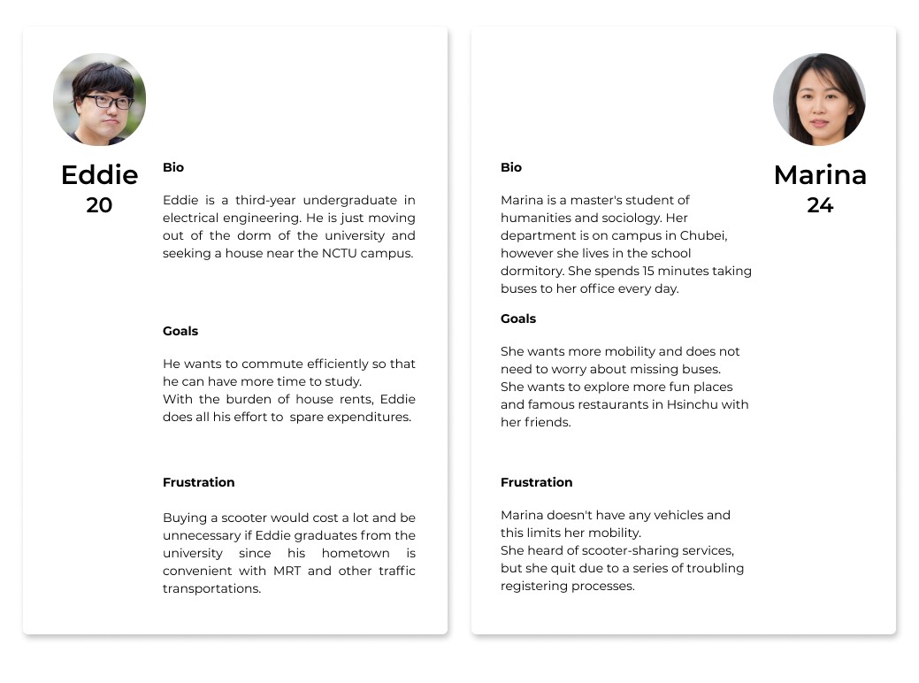
Two personas based on the interview of 5 students:
Users would like a more efficient and economical way to traffic around campus.
The registration process for existing scooter-sharing apps is complicated for students.
Two personas based on the interview of 5 students:
Users would like a more efficient and economical way to traffic around campus.
The registration process for existing scooter-sharing apps is complicated for students.
Competitive analysis
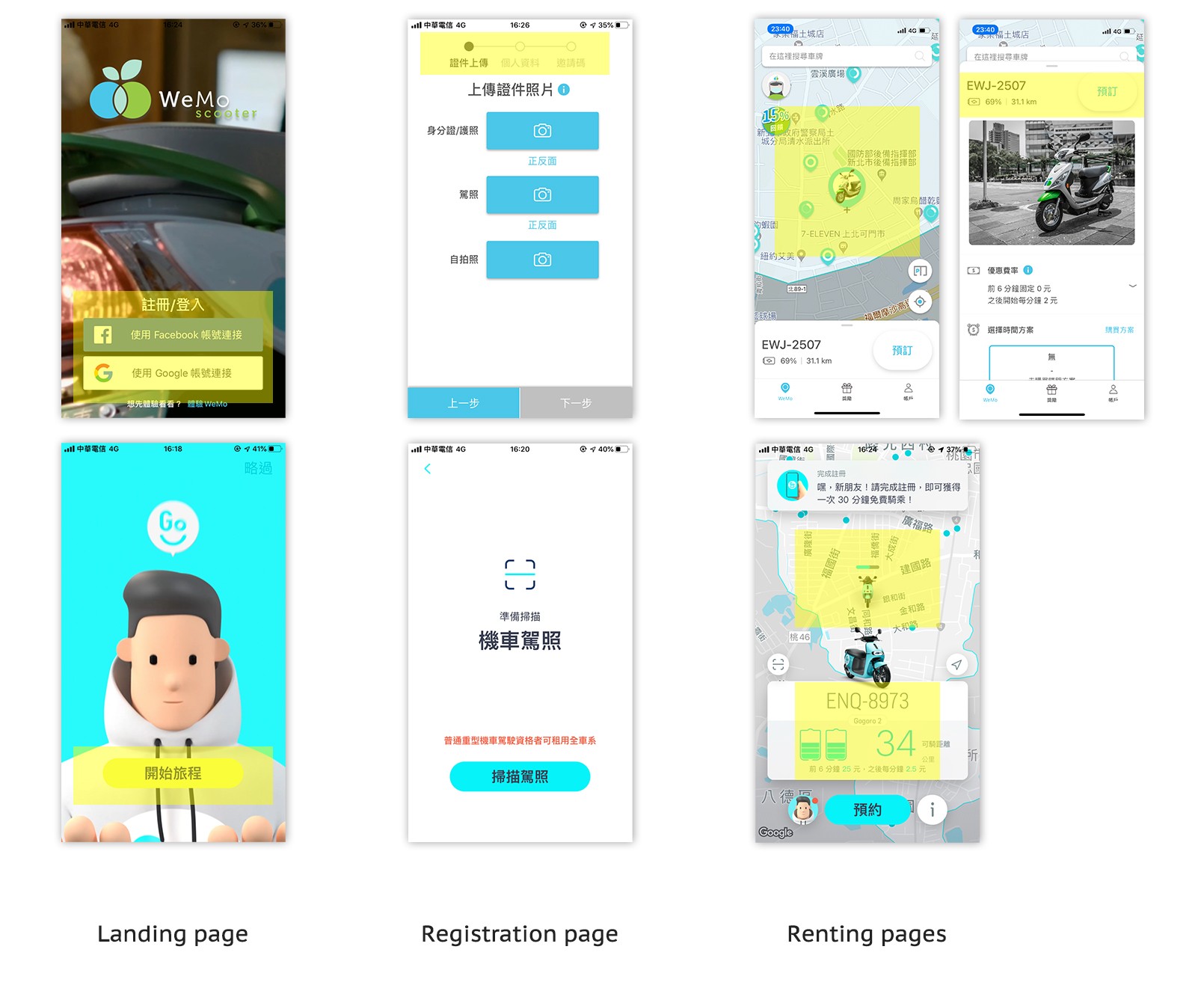
I examined the scooter rental apps in the Taiwan market and concluded with three main design features.
First, they need users to register with detailed information, which might confuse users and interrupt the onboarding experience. The two service providers designed different ways to help users finish registration. Wemo adopted linear navigation, which is familiar in many computer software installations, clearly showing the following steps. But, long linear navigation may cause users to lose patience. On the other hand, Goshare chose the immersive navigation guiding users to complete registration as a game, which is exciting but may annoy users who do not register for now or users who need complete control.
Second, they provide a map-based searching interface and a clickable scooter icon for more information. These designs allow users to find scooters intuitively and decrease the time and effort of searching.
Lastly, both Wemo and Goshare apply blue-green as the primary colors, presenting an efficient and smart brand impression. Plus, they adopted the radius corner design, eliminating users' mental effort and making the app more friendly.

The Design Problem
The Design Problem
Student commuters in Hsinchu have limited traffic options to achieve a more efficient life style.
3 HMWs
How might we provide a scooter rental service with high mobility and a friendly price?
How might we customize the scooter service to fulfill users' needs for commuting on campus?
How might we retain users during the tedious registration process?
User Flow & Prototyping
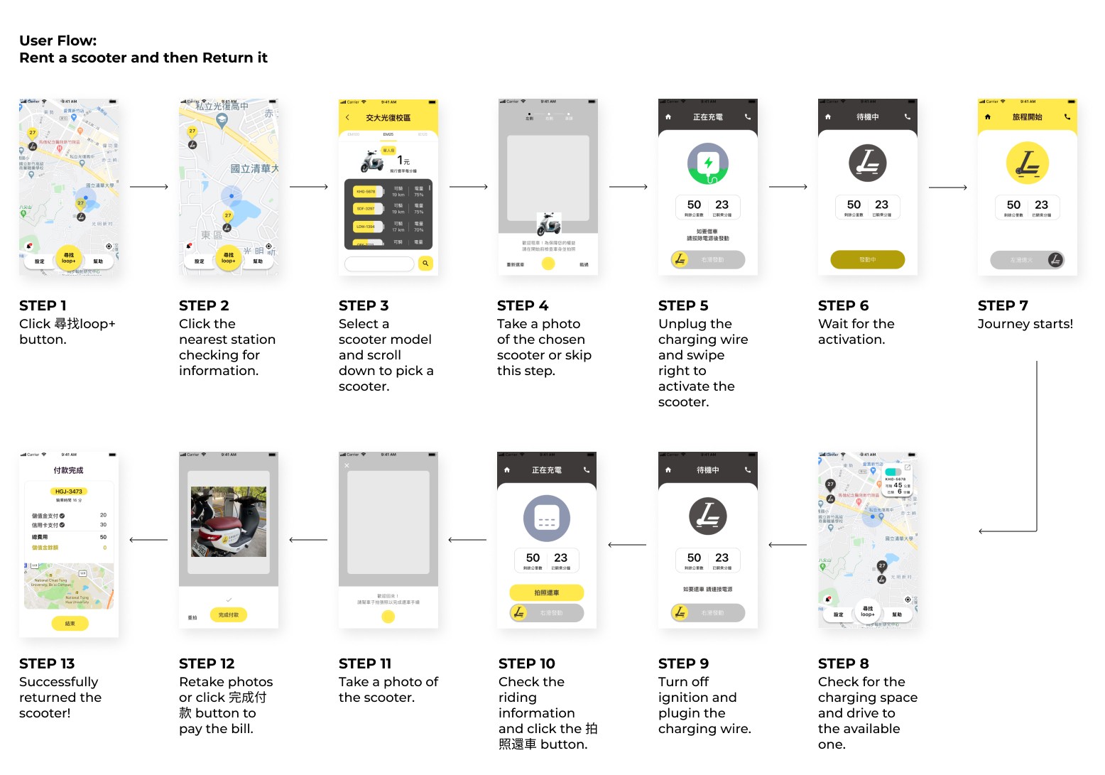

Adopting a map-based interface and the radius corner design, allowing users to search scooters efficiently.
As the user flow below shows, it is intuitive to search scooters on the map once they are locating where they are. Then, users can click the scooter icons to check more information, such as the remaining battery and rental price. Most importantly, the service is 24/7, giving students higher mobility and lesser cost.
As the user flow below shows, it is intuitive to search scooters on the map once they are locating where they are. Then, users can click the scooter icons to check more information, such as the remaining battery and rental price. Most importantly, the service is 24/7, giving students higher mobility and lesser cost.
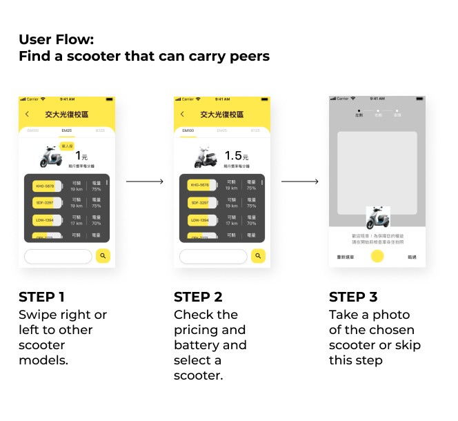

Providing three models of scooters. Users can rent any kind they need for any circumstances, like carrying friends or cutting expenditures.
I redesigned the renting page so that students who want to carry friends can swipe the renting page to select a scooter model equipped with a back seat pillion. Conversely, we also provide a single-seat model for people who enjoy riding alone to help users spend less.
I redesigned the renting page so that students who want to carry friends can swipe the renting page to select a scooter model equipped with a back seat pillion. Conversely, we also provide a single-seat model for people who enjoy riding alone to help users spend less.
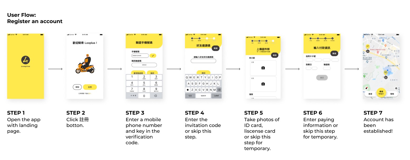

Combining linear and immersive navigation in registration progress, building a more straightforward registration.
As users open the Looplus app, a luminous and novel landing page guides them to the registration page. We removed unnecessary steps to keep users flowing to the main page. Users only need to fill in a valid phone number for the starter (immersive navigation). After that, the linear navigation and a skip button will be displayed on the top to hint to users these processes can be skipped for now.
As users open the Looplus app, a luminous and novel landing page guides them to the registration page. We removed unnecessary steps to keep users flowing to the main page. Users only need to fill in a valid phone number for the starter (immersive navigation). After that, the linear navigation and a skip button will be displayed on the top to hint to users these processes can be skipped for now.
In-Group User Testing
Based on the in-group testing, we discovered two main problems that need to be improved.
Based on the in-group testing, we discovered two main problems that need to be improved.
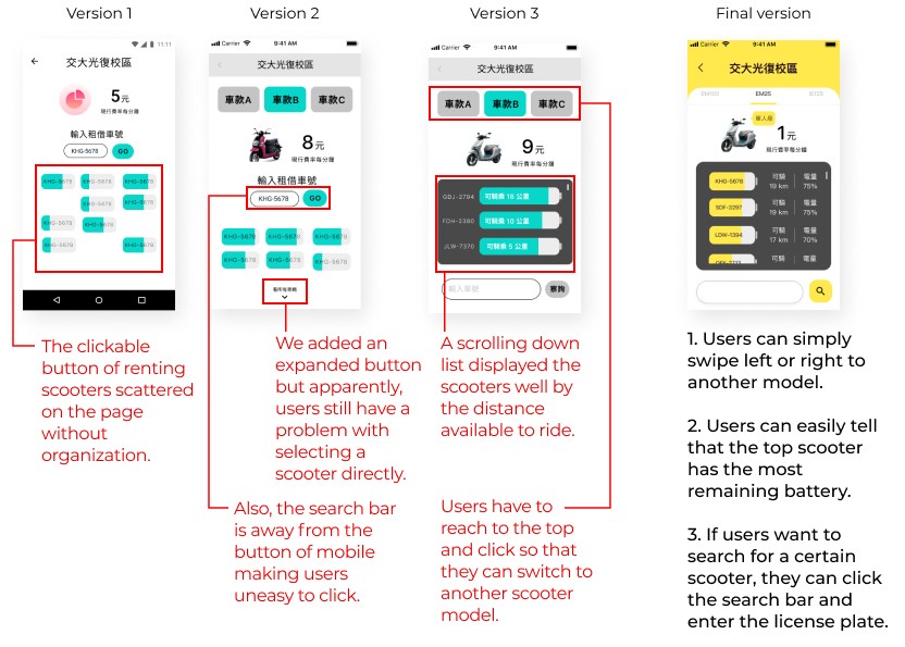

Mistake #1 Did not consider the technical constraints and scalable situation
On the original version of renting page (the green wireframes below), battery icons represent the scooters which were considered to be arranged by locations inside the parking station. However, the GPS is not precise enough to support locating within 10 meters. Besides the technical constraints, the user interface could not accommodate the displayed icons as the number of scooters increased. This makes it hard to identify which scooter is the best rental choice.
Hence, I redesigned the battery icons by arranging them to the vertical line and putting the highest remaining battery on the top so that users can easily rent the top with the best performance.
Moreover, I also moved the search bar to the bottom so that users who are used to typing in license plate numbers can even only use one hand free to input.
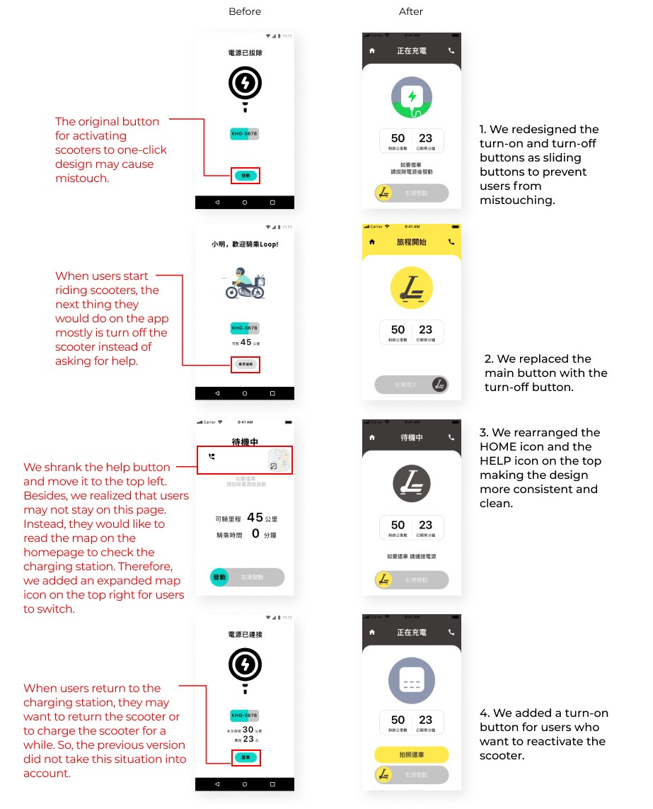

Mistake #2 Without taking the IoT system into account
The design of IoT needs to be foolproof, or it may result in users accidentally mistouching the activate button, causing dangerous accidents.
Therefore, I replaced the one-click button with a slide button where users need to spend a little time and make a gesture to activate or deactivate the scooters successfully.
Moreover, I considered the whole riding user flow with real user scenarios in mind. For example, when the user rides the scooter, the next step they would operate on the app is deactivating it or searching for a charging station instead of asking for help. Hence, I redesigned those call-to-action buttons on the bottom and displayed the secondary button (like Help) on the top where users are less likely to touch.
Reflections
After 3 months of design work and a 9-month development and iteration process, the Looplus app is ranked 4.2 on the App Store, and the charging stations are expanding. I appreciate the amazing team that made this promising work happen. Most importantly, I witnessed that the iteration design makes it better. I have learned five things that inspired me the most:
After 3 months of design work and a 9-month development and iteration process, the Looplus app is ranked 4.2 on the App Store, and the charging stations are expanding. I appreciate the amazing team that made this promising work happen. Most importantly, I witnessed that the iteration design makes it better. I have learned five things that inspired me the most:
Besides understanding users' needs, designers must understand how the machine works and bridge the gap between them. Always be open to any possibility of operating ways or even BUGs.
Besides understanding users' needs, designers must understand how the machine works and bridge the gap between them. Always be open to any possibility of operating ways or even BUGs.
If problems occur, ask for people's feedback instead of doing it alone.
If problems occur, ask for people's feedback instead of doing it alone.
Consider the product's actual operating attributes. Since the Looplus is an app that users open when standing under the sun or in the cold wind, we need to cut down their effort to finish the goals, which are the criteria of my design principle as well.
Consider the product's actual operating attributes. Since the Looplus is an app that users open when standing under the sun or in the cold wind, we need to cut down their effort to finish the goals, which are the criteria of my design principle as well.
Establishing a design rule is essential. Design without restrictions is not a good design.
Establishing a design rule is essential. Design without restrictions is not a good design.
Be confident in negotiating with others, especially when the design is well-proofed.
Be confident in negotiating with others, especially when the design is well-proofed.